Every time your nonprofit asks for money, pushes for publicity, or suggests a collaboration with another organization, one of the biggest factors influencing their response is how they perceive your nonprofit. Do they remember you? Do they recognize your name? Your logo? Do they know your mission?
To build that perception, you need a consistent and recognizable brand. Every time you’re mentioned—every time you’re seen—you must have consistent wording, colors, fonts, and styles. That was the objective of my branding project for Yellowstone Wildlife Sanctuary.
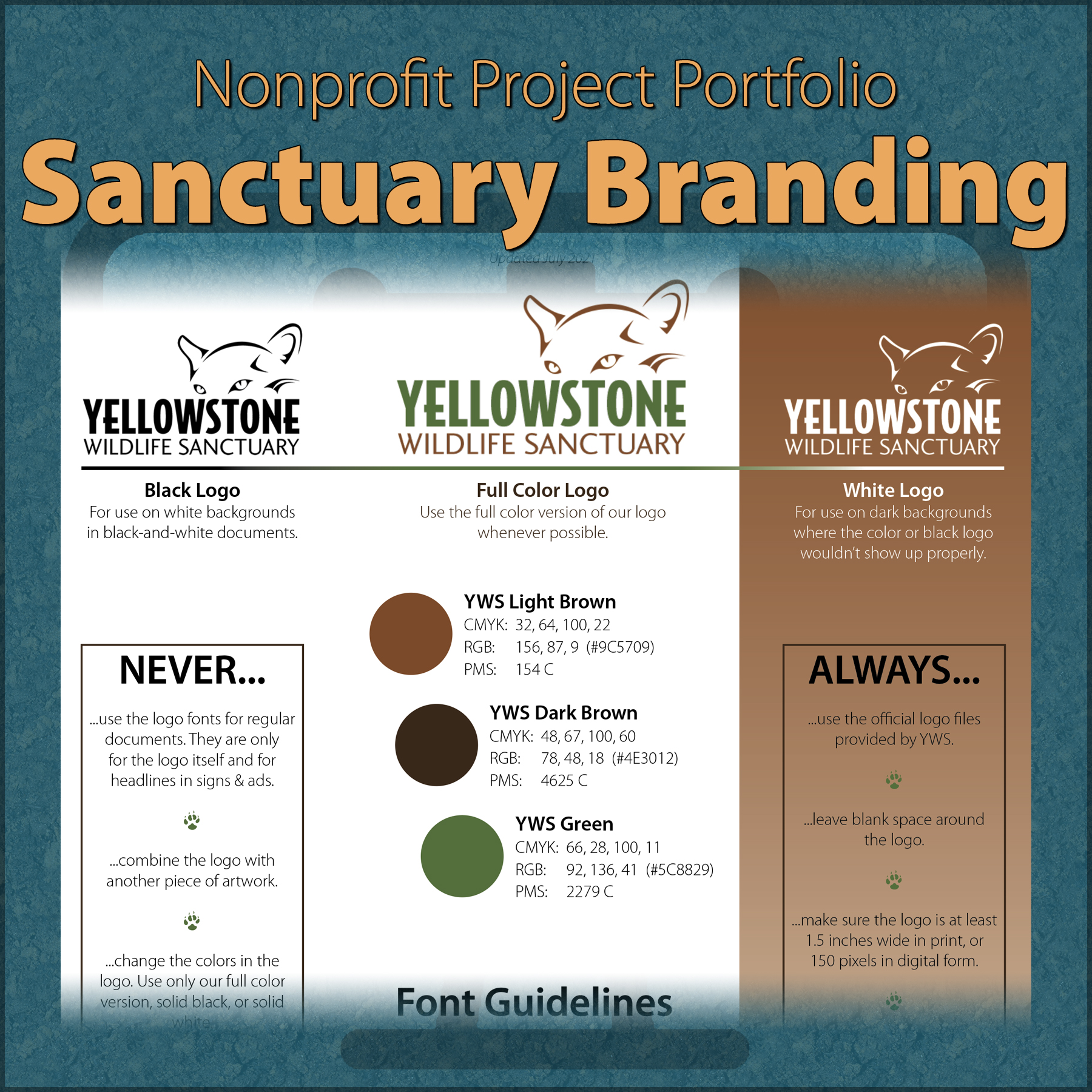
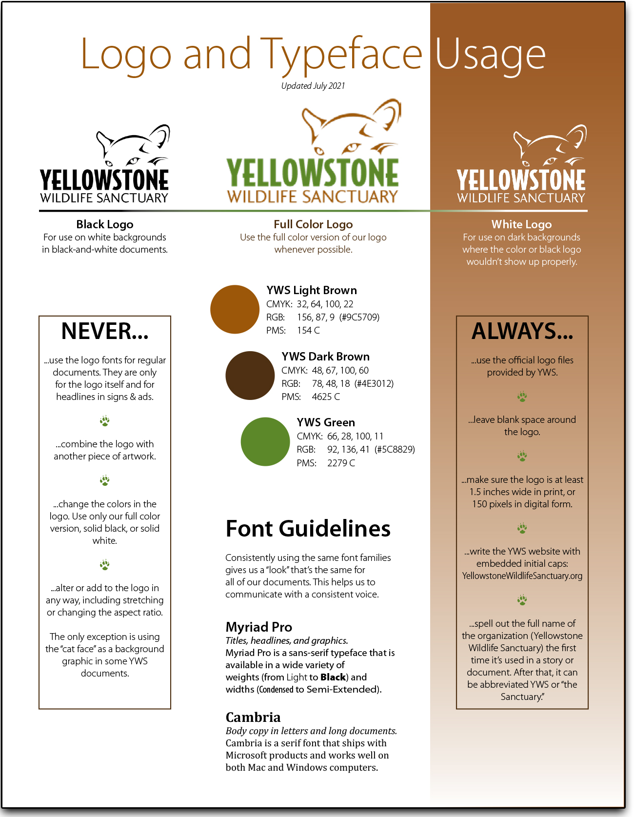
I created a detailed document for internal use (more on that below), and then created a single-page quick reference. That easy-to-follow document is not only used internally, but it’s on the Sanctuary’s website where reporters and consultants can easily access it.
Once that was complete, I set up color palettes in Adobe Creative Cloud and Microsoft Office 365 to make sure they’d be used consistently.
Logo
The logo was the only piece of the branding that was already in place when I started the project. Unfortunately, it only existed in low-resolution files, and didn’t have design notes. Figuring out the fonts used in the design took a while, but I eventually found them. I adjusted the colors a bit to match the new palette (see below) and redrew the logo as a vector file so that it could be scaled up or down to any size without losing resolution.
Then I created a black version for use on white backgrounds and a white version for use on black backgrounds.
Colors
Everyone on the board of directors liked the colors in the logo, although they were applied inconsistently. I modified them slightly so that there was a closer match to Pantone colors for paints and the RGB and CMYK versions were very close to each other. Using the two new logo colors as a starting point, I created a three-color palette to be used for everything at the Sanctuary, from building exteriors to signage to website design.

Typefaces
It may be largely subliminal, but consistent typeface usage helps with brand recognition. I selected a serif typeface for body copy that ships with all Microsoft products, making it likely to be on every computer an employee uses. For title, graphic, and headline use, I picked a sans-serif font family that’s available with a wide variety of weights and widths. For anyone using a computer that doesn’t have that font loaded, I also specified an alternative font for the sans-serif one.
Other pieces of the branding
With the primary pieces of the pie completed, I went on to define all of the related parts of the brand:
- Rules for consistent use of the Sanctuary’s name (e.g., Yellowstone Wildlife Sanctuary or YWS; never Yellowstone Sanctuary or Yellowstone Wildlife)
- A “favicon” image for the website, since the logo is too complex for small sizes
- Social media image and profile guidelines
- Word usage guidelines (e.g., always say habitat or enclosure; never say cage or pen)
- Document layout guidelines, which included premade style sheets for Microsoft Office
- Usage of domain names and email addresses
- Blog post layout
- Use of other logos & badges, like the City of Red Lodge brand, the Accredited Sanctuary logo, and the GuideStar seal of transparency
Tools used for this project
- Adobe Photoshop for creating the logo files and color swatches
- Microsoft Word for creating the branding and style guide
- Adobe InDesign for creating the single-page quick reference