I’ve gotten a lot of questions about book cover design over the years, and even written a few blog posts about it. For my newest book, The Bounds of Magic, I decided to document the process. Hopefully, it will interest my readers and be informative for new authors.
The process began in late November, about three months ago. I looked for fantasy book cover artists through web searches and sites like DeviantArt. At the time, I wasn’t sure whether to position the book as adult fiction, YA (young adult), or NA (new adult), so I also went through SCBWI, the Society of Children’s Book Writers and Illustrators. I’ve been a member for 20 years and I know there’s overlap between YA and children’s illustrators.
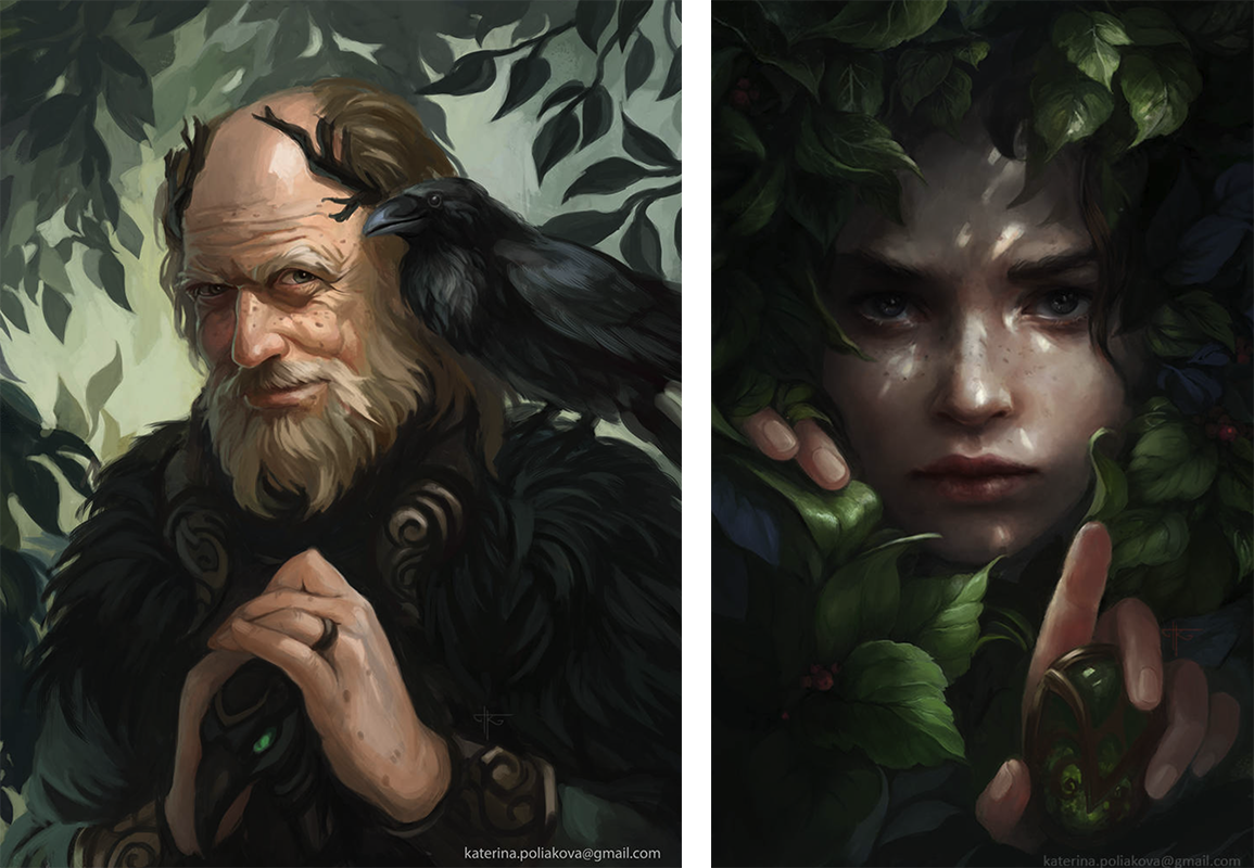
After finding a half-dozen artists that seemed like a good fit, I sent each of them an email telling them how I found them, describing what I wanted, and asking for a quote. I also told them which of their illustrations I liked and what the timeline was. I was particularly drawn to an artist named Katerina Poliakova from England because of the way she drew these two faces (more about Kate later in this article):
I sent each potential artist a variation of this description (I was tweaking it as I went, so the first artist I contacted didn’t get quite the same description as the last one).
The cover is for a fantasy novel. Most of the readers will be in their late teens to early 30s. The cover shouldn’t look overly dark or overly sexy. A glance at the cover should tell readers that the book is a fantasy novel.
The book is the first of a series, so we’ll want to establish a look we can carry through as a recognizable theme for the series. I’ll be ready to greenlight the cover for Book 1 in early January. Book 2 will probably be ready for cover art in 6-8 months.
The opening paragraph tells the artist what I’m looking for so they can decide if they’re a good fit. The second paragraph lets them know that there’s potential continuing work and what the schedule is. Again, if this isn’t the kind of gig they want, let’s not waste anyone’s time! The email continues:
The focus of the cover should be the two main characters. This is a small-town medieval setting, so think Scottish forest or small Scandinavian village rather than big city. The main characters are best friends at the beginning of the book, lovers by the end. Their pose on the cover should indicate how close their relationship is. They’re poor and unsophisticated, so no super-fancy frilly clothing. Here’s their description:
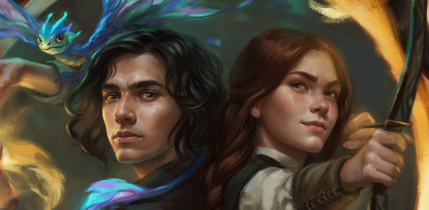
SKOGABAN is an 18-year-old boy with unkempt shoulder-length dark brown hair and soft brown eyes. I don’t want an obvious race, but his skin tone and facial features should be vaguely Indian/Pakistani. He wears an ivory-colored coarse linen shirt with a brown vest over it and brown pants. He doesn’t wear shoes. He has some magical abilities. In the cover art, he should be holding out his right hand with a conjured flame in it. The light from the flame should illuminate his face.
On Sko’s shoulder is NOODLES, a fairy dragon. Here’s his description straight from the book: “The little creature was smaller and lighter than a rabbit but had a tail over twice the length of his body. He was covered in iridescent green scales everywhere except his belly, which was a pale yellowish green, and his wings, which looked like they were shifting colors, going through pastel tints of all the colors of the rainbow.” His tail should be protectively curled around Sko’s neck. Sko is the protagonist, not Noodles, so don’t let him eclipse Sko.
DACEY is an 18-year-old girl with bronze tanned skin, straight light-brown hair falling halfway down her back, and golden-brown eyes. Her grin is slightly asymmetrical. She wears earth tones, typically with a light peasant blouse with a sleeveless darker-colored dress over it. She is just a bit taller than Sko. She has curves, but not exaggerated Marvel-comic type chest and waist. She wears clothes that are a bit loose. She is often either barefoot or wearing hunting boots. In the cover picture, she should have a short bow with an arrow nocked, looking alert and protective of Skogaban.
To get an accurate quote, the artist needs to know how many characters will be on the cover. Most will charge more to draw two people than one. The description gives the artist a feeling for the characters. Some of this information ended up not mattering. The final cover ended up “zoomed in” on their faces so you couldn’t see their feet.
I had to get specific about what I don’t want Dacey to look like because so many fantasy books these days have sexy covers that don’t look at all like the way the character is depicted in the book. I have nothing against bodice-ripper romances, but that’s not what I wrote. A cover like that would just be false advertising for The Bounds of Magic.
I don’t want a complex background. Dappled lighting with the suggestion of out-of-focus tree trunks and leaves will be plenty.
Some authors want a lot of detail in their cover backgrounds. Again, cover artists will charge more for that. I wanted the artist to know that my background will just be a background.
This next paragraph may not be important to you, but it matters a lot to me. I’ve built my entire career around intellectual property (IP) that can be copyrighted or trademarked. Software, electronic designs, books, magazine articles, voice acting, etc. All manner of things that can be replaced (often quite poorly) by artificial intelligence / large language models. I want to support creative people!
Absolutely no AI content or anything that even looks like AI or LLM content! I like custom art from human artists. If you can include details that scream “custom handmade art,” please do.
The next thing that’s important are the technical details. You need to explain these things up front so the artist knows what you need. Some types of book covers can be done with vector art so the resolution isn’t important, but I wanted hand-drawn artwork. Resolution matters a lot.
The book is standard trade paperback size: 6×9 inches. At 320 pages, the spine will probably be .67 inches, but this is approximate. The spine and back cover should just be a continuation of the background from the front. I’d like the art in digital form at 300 dpi or higher – 600 dpi is better when I do the posters.
Again, some of these details changed as we went. The book ended up at 350 pages instead of 320 after some last-minute changes and additions. That increased the width of the spine to .781 inches, and there had to be a few adjustments for the hardback cover as well (larger bleed area, wider spine).
I generally do my own text for covers. I’m certainly interested in seeing what you’d do, but all text would need to be on a separate layer in the artwork so that I can modify or replace it if I need to. I’ll be doing the back cover design, including blurbs, EAN barcode, spine, and so forth. You don’t need to worry about that part at all, except for making sure there’s room for the extra stuff. The publisher logo is small, and will only appear on the spine and back cover.
One of the artists bowed out immediately, saying that the “custom art from human artists” clause was an issue. The others sent quotes which ranged from a few hundred to a few thousand dollars. Most were in the $300 to $600 (U.S. dollars) range. I selected Katerina Poliakova (the one that drew the great faces) as my artist. We went over rights and other contractual stuff and made a deal. She asked for more information about the main characters’ personalities.
If your writing process doesn’t include writing descriptions of your main characters’ personalities, stop and do that. It’ll help you in your writing. It’ll also help your cover artist. Few cover artists are going to take the time to read your book all the way through before drawing the cover, especially if they’re only getting paid a few hundred dollars. The initial description I sent in my request for quote was all about physical characteristics. The follow-up descriptions allowed Kate to adjust facial expressions and body language to match their personalities.
The first thing Kate sent me was a grid of nine thumbnail sketches showing different poses and different fonts for the title text. Here’s one row of the grid:
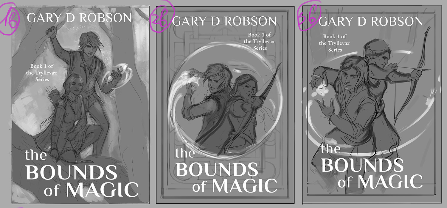
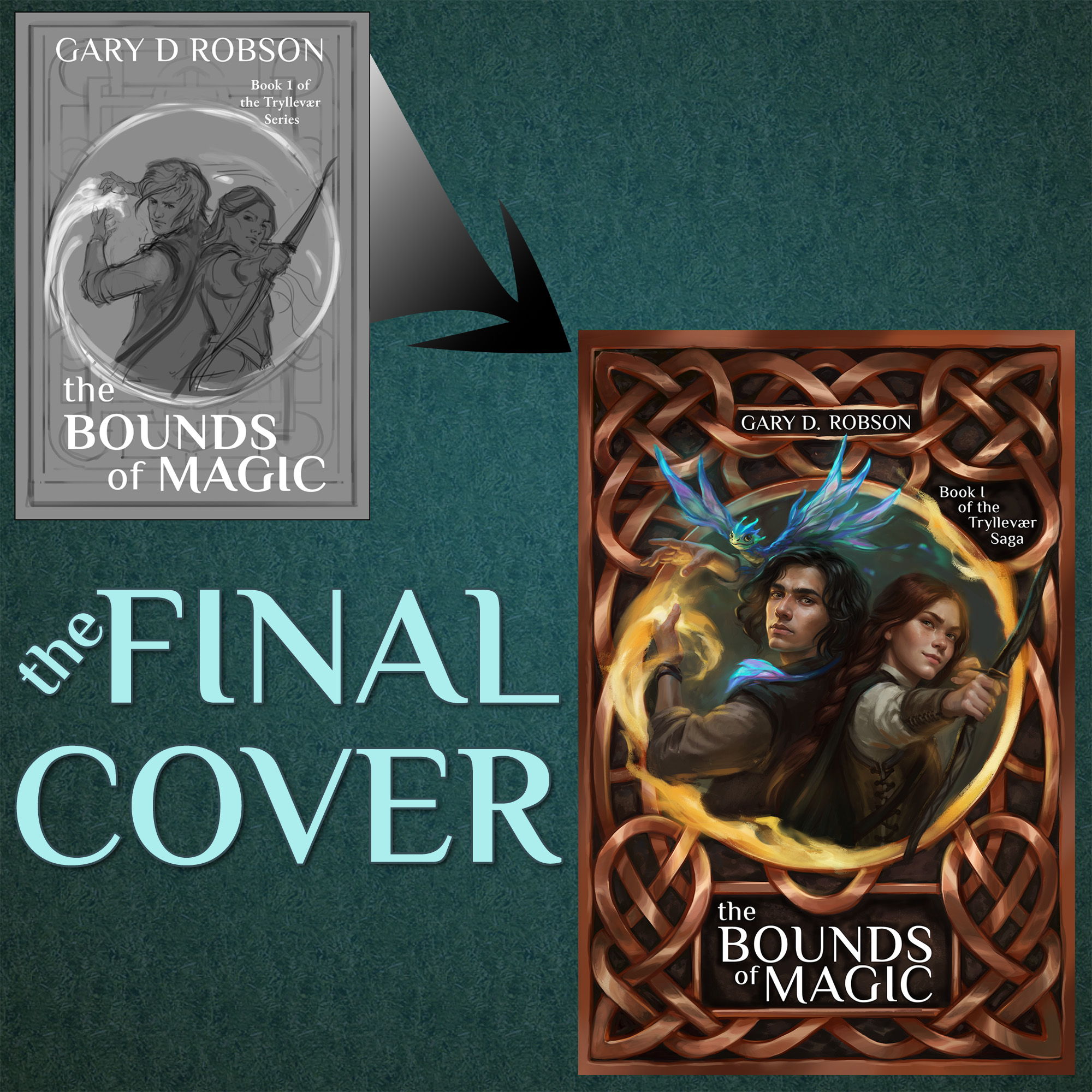
The middle one (“2B”) really called to me, and I told her to go that direction. I liked the idea of the pseudo-Celtic knots in the background and the poses of the characters. She added the faerie dragon (who doesn’t actually appear until halfway through the book) and took a first pass at colors. She sent me more sketches to look at. My favorite was this one:
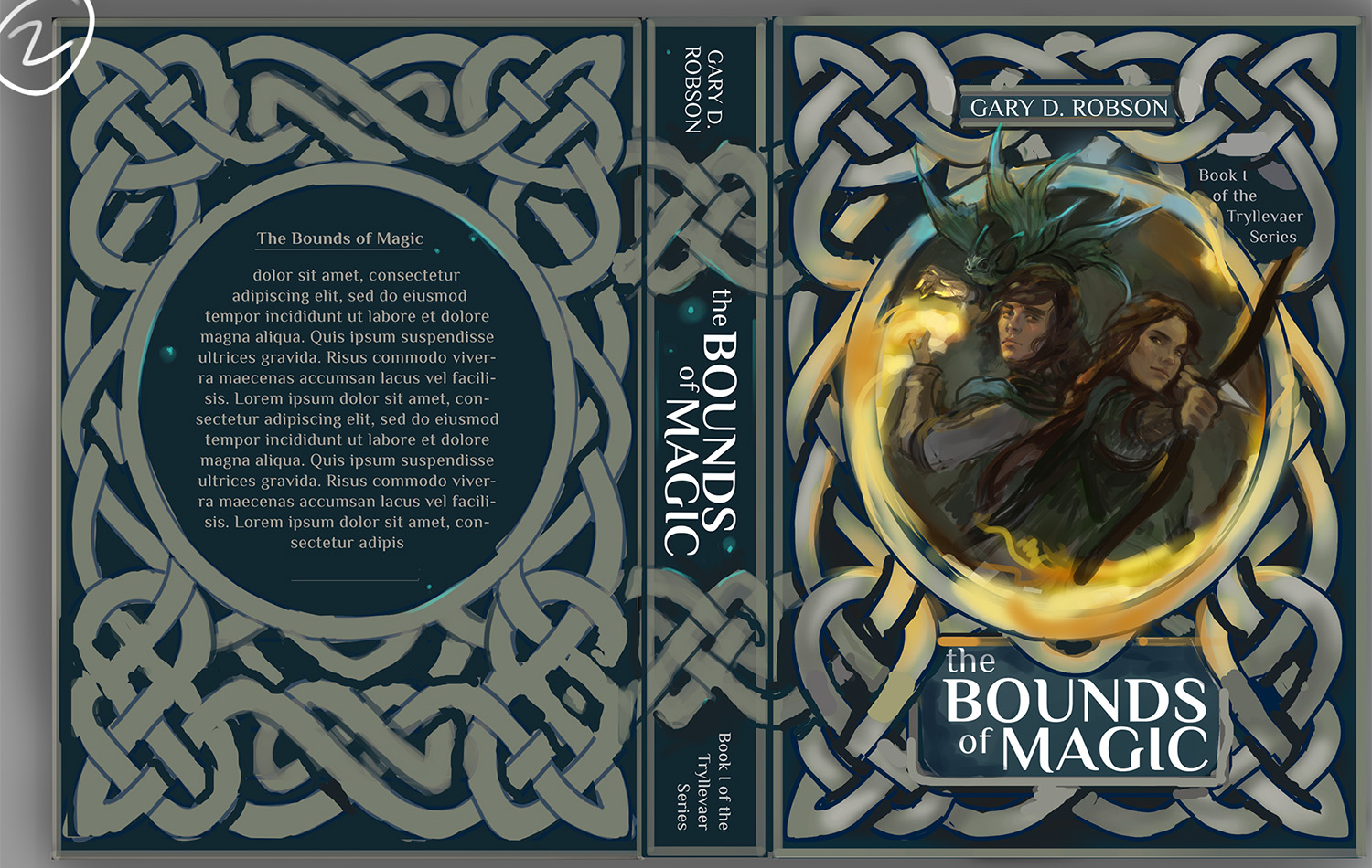
Again, there were some changes to make. I didn’t like Sko’s bored expression, and Dacey’s hair wasn’t quite right. Also, I wanted a metallic copper for the background and room on the back cover for the barcode, publisher logo, author photo, and so forth. After several more iterations, we landed on the final cover design. She sent it to me with empty frames on the back cover in a layered Photoshop file so I could tweak the text as needed. The final result, which I’m absolutely thrilled with:
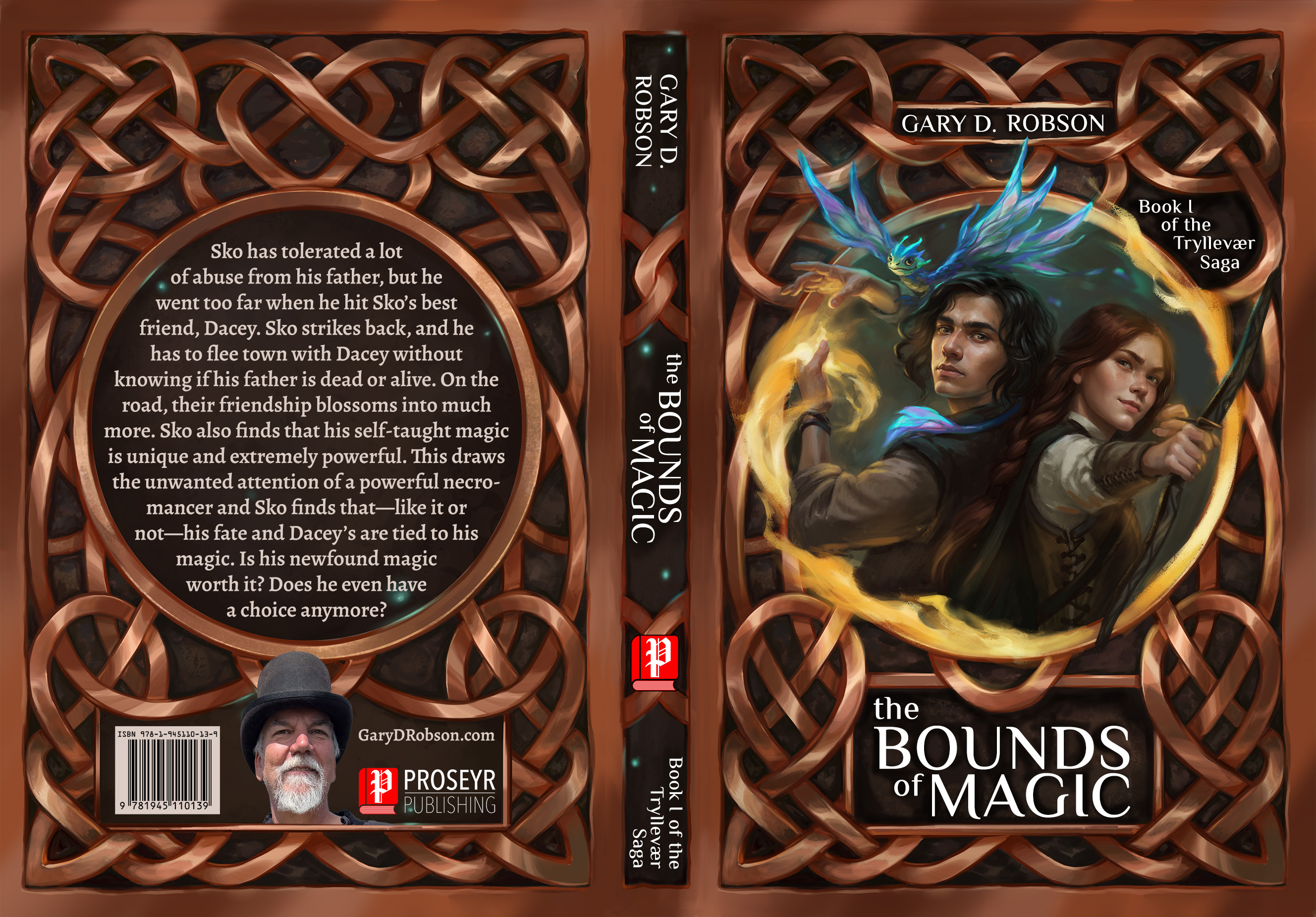
So, after 2-1/2 months and about six million emails, we had a final cover design. Because we worked together so closely, the depictions of my protagonists are absolutely perfect, the cover screams “fantasy novel,” and the artwork is high-enough resolution to look good at poster size for live events. Best of all, look at those faces!
Now I’m ready to start thinking about the cover design for book 2 in the series.
If you’d like to see more of Kate’s art, take a look her up on DeviantArt or follow her in Instagram. She goes by PearlOfLight on both.
If you want to know more about The Bounds of Magic, sign up for my newsletter. It has exclusive content that isn’t on this blog. The book goes on sale April 7, and newsletter subscribers will get a special pre-order offer, too!
